
Description
Foxad Technologies has been in operation since 2010. As they transition into the digital age and utilize social media for advertising, they needed a visual identity that will set them apart and make them stand out.
They reached out to us, and we actively collaborated with their team to interpret their ideas.
Project Requirement
- A new Logo.
- Corporate identity design.
- Branded assets for marketing & promotions.
- Defined color palette.
- Social media assets.
-
Client:Foxad Technologies
-
Start:Feb 6, 2024
-
Ending:March 6, 2024
-
Website:Coming Soon
-
Share:
Project Result
NAMING : The FOXAD brand has been in existence since 2010. The name was derived by combining the words "Fox" and "Ad" together. It was inspired by the technology advertisements the CEO constantly watched on FOX TV. Hence, "Fox" and the first two letters of "Advertisement" birthed FOXAD.
THE LOGO : The Foxad Logo is a combination mark illustrated in Adobe Illustrator. The brand name and a circular icon represent the letter "O". The icon and its color depict the sun, symbolizing energy and light for vision. The four lines converging at the center of the icon, resembling an eye, represent surveillance from a camera hole, which translates to one of the services offered by the brand.
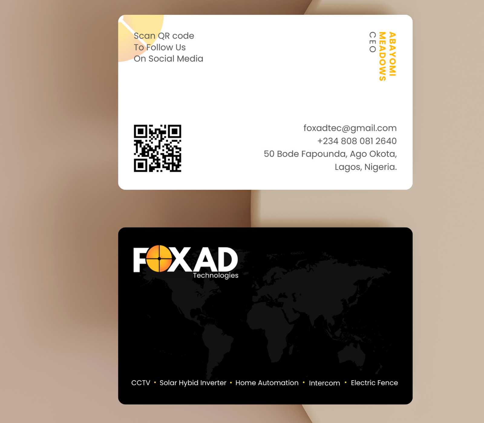
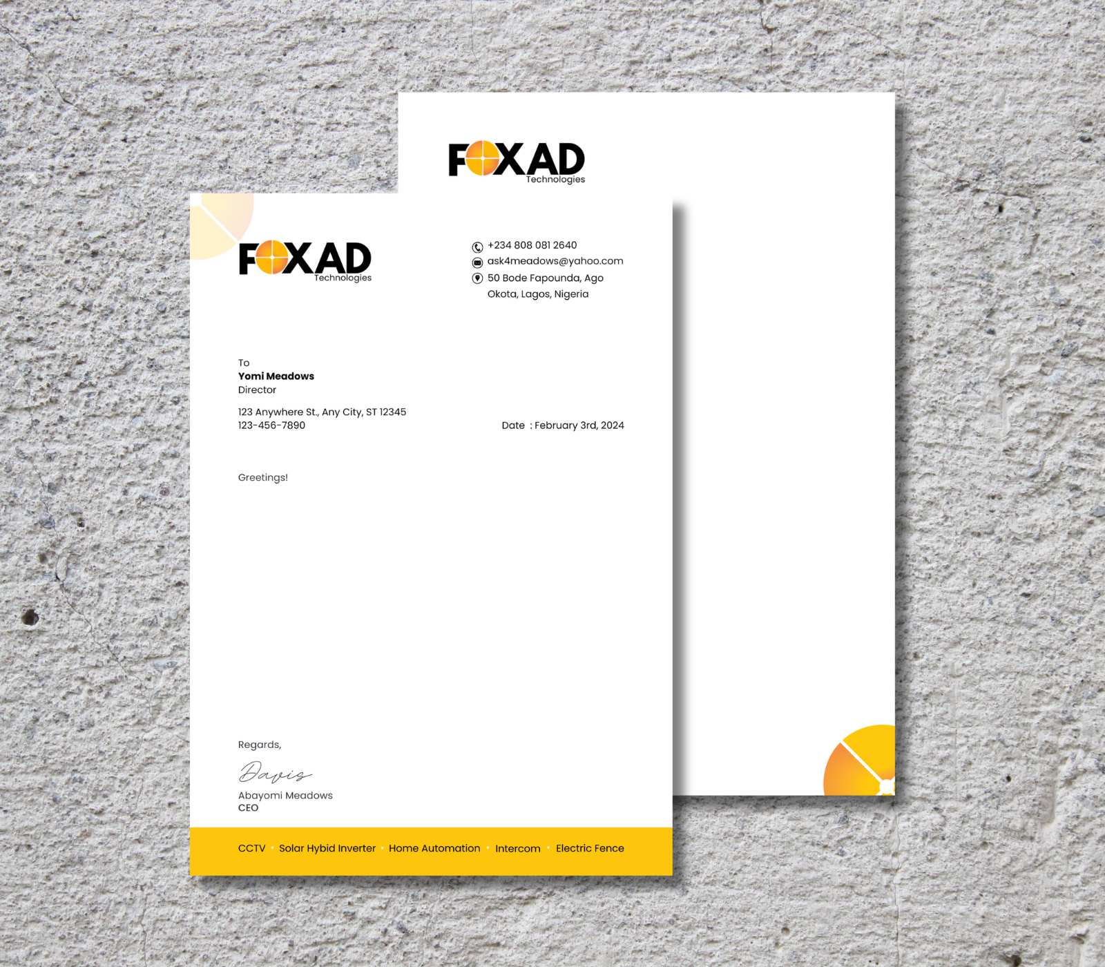
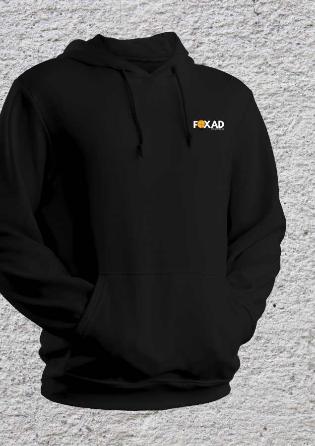
VISUAL IDENTITY DESIGN : We worked closely with the stakeholders at Foxad Technology. It was very exciting because we were given the green light to innovate with less of their input. The result was the design of a logo, definition of brand colors, creation of marketing materials, social media assets, business cards, letterhead, and invoice.


